resources
shadcn/create - It's just perfect!
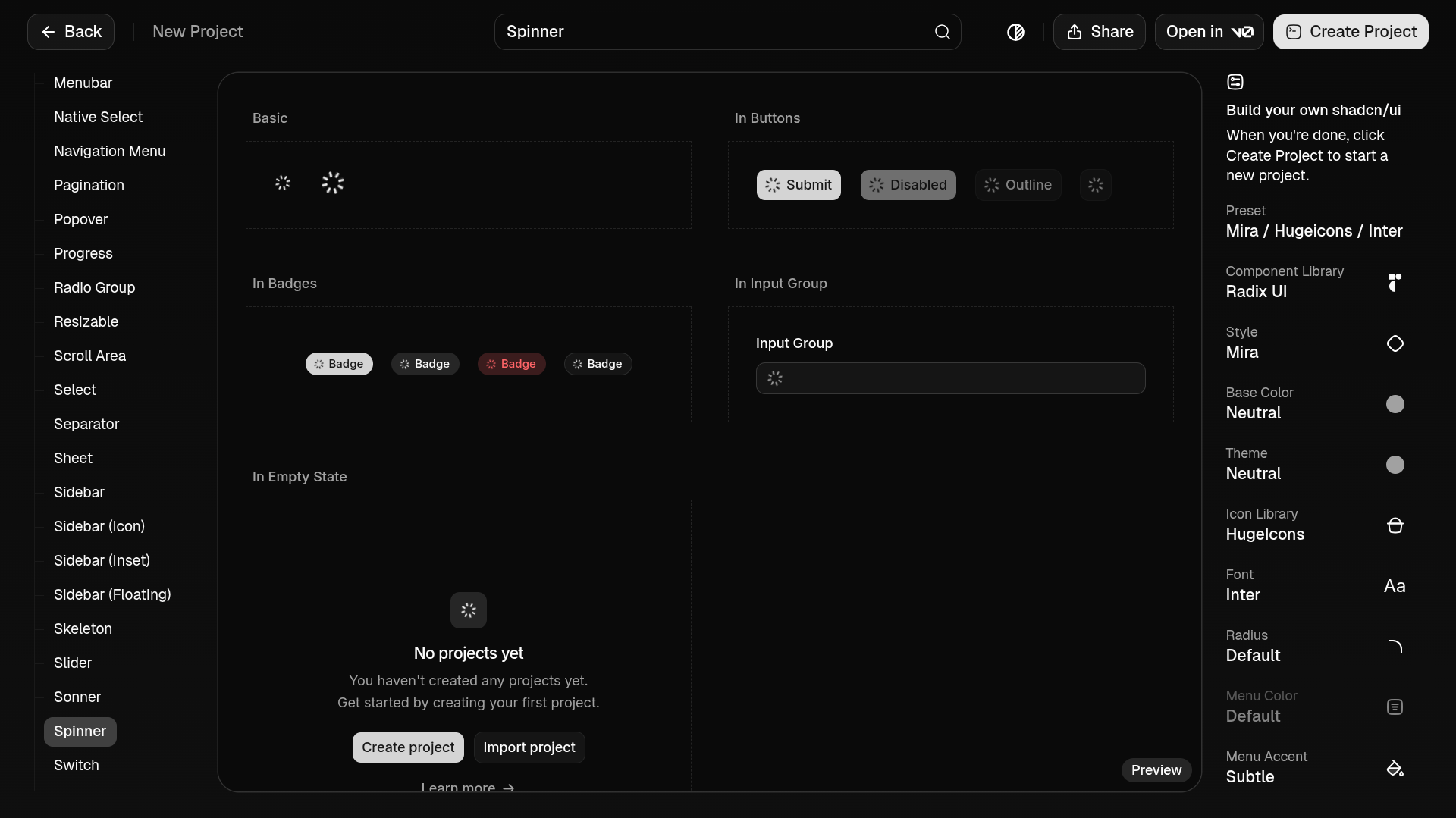
shadcn/create main page
In the ever-evolving world of frontend component libraries, shadcn/ui has quickly become a favorite for developers who want flexibility without sacrificing design quality. It offers a beautifully minimal base design with maximum customizability—but that strength has also been its biggest pain point for newcomers and even intermediate users. That’s where shadcn/create comes in, and it might just be the best thing to happen to shadcn/ui so far.
The Power and Challenge of shadcn/ui
At its core, shadcn/ui provides unstyled, accessible React components built on Tailwind. That means you’re not stuck with a specific visual style—you can tailor everything to your brand, from buttons to dialogs, dropdowns to modals.
Here’s the trade-off: this power comes with a steep learning curve.
If you don’t already know Tailwind deeply, or if you’re new to the way shadcn/ui structures components:
You might spend too much time just figuring out where to start.
You might avoid customizing components you should be customizing because you aren’t sure which utility classes to apply.
You might fork things unnecessarily because it feels easier than editing the core components.
Customization should feel fun and freeing—but for many, it felt confusing.
Enter shadcn/create
That’s where shadcn/create ↗ changes everything. Instead of manually editing component files and guessing Tailwind utilities, shadcn/create provides an intuitive way to generate exactly what you need.
In simple terms:
Want a button with a specific variant?
Want a form component already tailored to your design system?
Need to iterate quickly without boilerplate drag?
shadcn/create lets you generate components on demand, already configured for your project—saving time and mental space.
Why This Matters
Customization stops being intimidating. The barrier between “standard component library” and “fully bespoke UI system” suddenly dissolves. With shadcn/create:
Developers can confidently customize UI without being Tailwind experts.
Teams can standardize design tokens and variants quickly.
New contributors to a codebase can onboard faster because generated components follow predictable patterns.
This is the moment shadcn/ui stops feeling like “a great tool only if you know what you’re doing” and becomes “a great tool you can get comfortable with immediately.”
A Shift from Manual to Intent-Driven Development
Before shadcn/create, making a small change—like adjusting spacing on a badge or tweaking a dialog’s corner radius—meant diving into component internals. With create, you operate at a higher level: specify what you want, and tool does the rest.
That’s a subtle shift, but it’s huge:
Manual tweaking → Intent-driven creation
Guessing styles → Guided generation
Editing everything by hand → Creating components with purpose
In the end, this makes shadcn/ui not just a component library, but a usable design system foundation.
Final Thought
shadcn/ui was already a brilliant idea: give developers pristine, accessible components they can shape however they like. shadcn/create takes that idea and says, “Here’s the steering wheel.” Suddenly, customization feels less like climbing a mountain and more like crafting something fun and intentional.